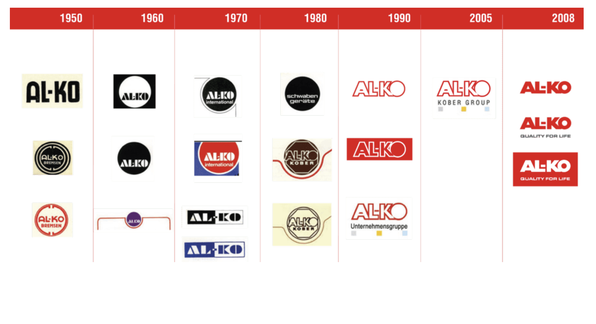
For more than 90 years, AL-KO has been known for quality, innovation, and German design in the outdoor power equipment industry. Today it is being introduced to the U.S. market.
Brand Legacy
AL-KO is new to the consumer we’re speaking to in the U.S. But it is not new to the industry.
For more than 90 years, AL-KO has engineered and manufactured outdoor power and That legacy matters.
As we build trust in the U.S. market, our history becomes part of the marketing language.
Because people instinctively think: If it’s lasted 90+ years, it must work. If a brand has endured that long, it’s earned trust.
This history has inspired us as we’ve explored the brand launch.
We knew the brand direction had to reflect the same longevity.
So when we mapped out where to take AL-KO, we looked for source of overarching inspiration, something timeless and functional
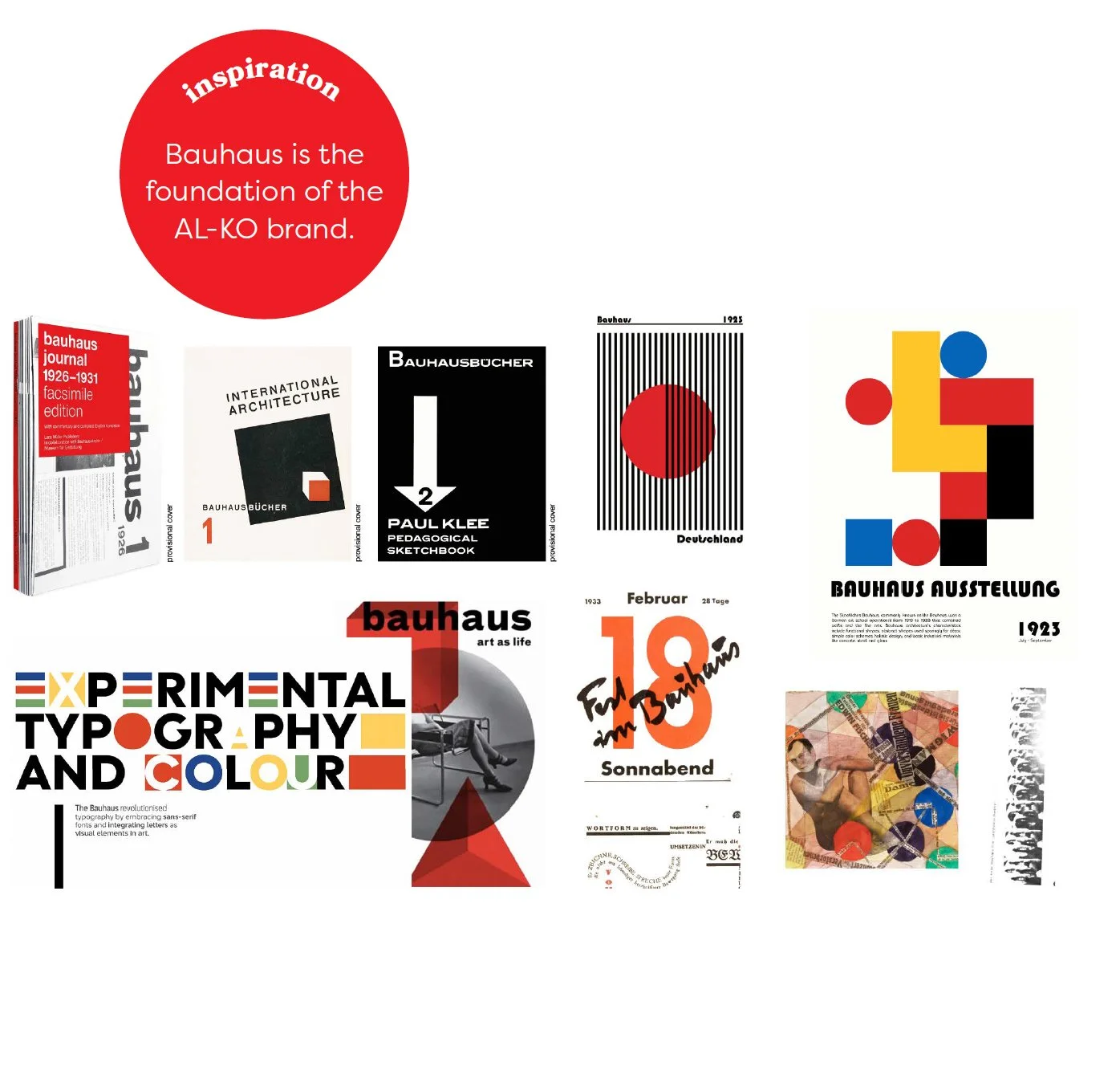
That led us to Bauhaus
Inspiration: Bauhaus
Bauhaus introduces a German nod. It provides inspiration, something to dive into and discover a continuous source of ideas.
Motto: “Play becomes party – party becomes work – work becomes play.”
Today’s youth, raised inside technology, do not resist the machine, they embrace it. What they crave is not less innovation, but more meaning: art and industry working together, and brands that are both efficient and soulful.
It is an art movement that combines art and technology.
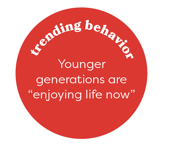
Inspiration: Nouveau Nihilism
Bauhaus gives us the design foundation — but we also looked at cultural behavior.
Younger generations are operating with a “live for today” mindset. Traditional milestones feel delayed or out of reach.
That creates a shift: people are looking for enjoyment, novelty. They explore brands more.
This is where AL-KO has opportunity. We’re not just selling equipment. We’re supporting the life people are building right now.
Durable, engineered tools — but positioned in a way that feels modern, optimistic, and relevant to today’s mindset.
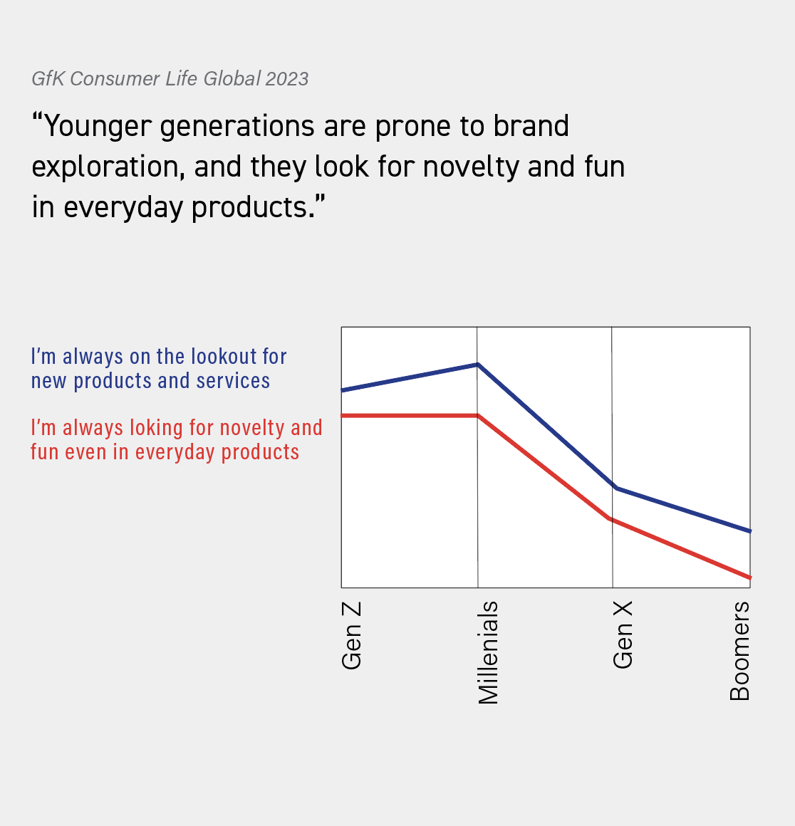
So now we dive in. Our role isn’t to reinvent AL-KO. It’s to honor what already exists And bring that into the U.S. market in a way that feels relevant today. Respect the legacy. Translate it for a new audience.
Brand Promise
The brand AL-KO is about tools built for real life, yards, and people.
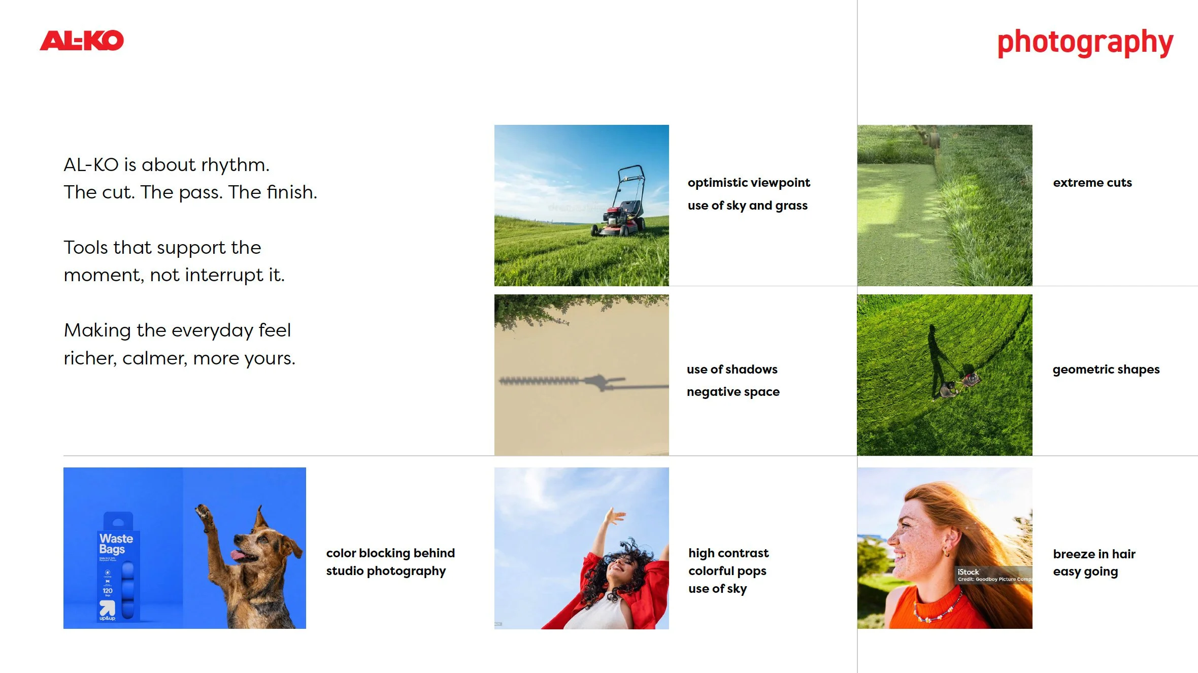
Now the feeling that we would like consumers to take away from the branding goes beyond that, in marketing message and visuals we want to support the small joys of meaning and delight that can be discovered in the ordinary routines. The sun coming through the trees, or the breeze in your hair. The feeling that being outside, in your space, and accomplishing a task can instill.
We are not saying that mowing your lawn or trimming your hedge is an amazingly fun thing to do with your weekend, what we’re saying is that if you absorb yourself in your task or look up and smell the fresh grass, a smile just might creep on your face.
Position Statement
AL-KO delivers trusted engineered tools, modern performance, and an attainable price. That’s our position.
But emotionally, we position the brand around something bigger.
Saturday morning, you’re blowing the leaves that fell in your driveway from your favorite oak tree - you’re living the life. The life that you’ve built and worked for, you own this home, you take care of it, and this is THE LIFE.
This is YOUR tree, this is YOUR yard.
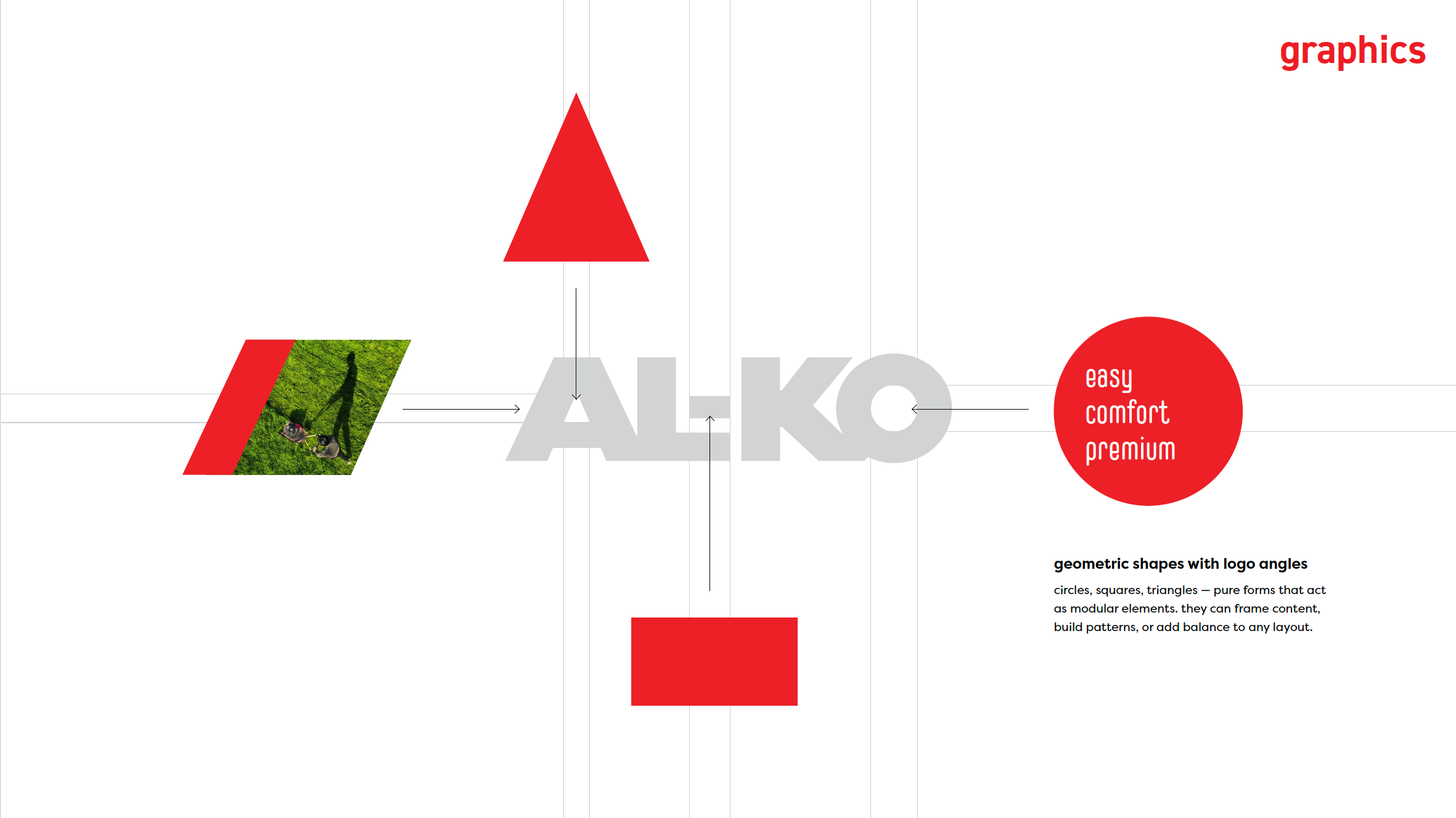
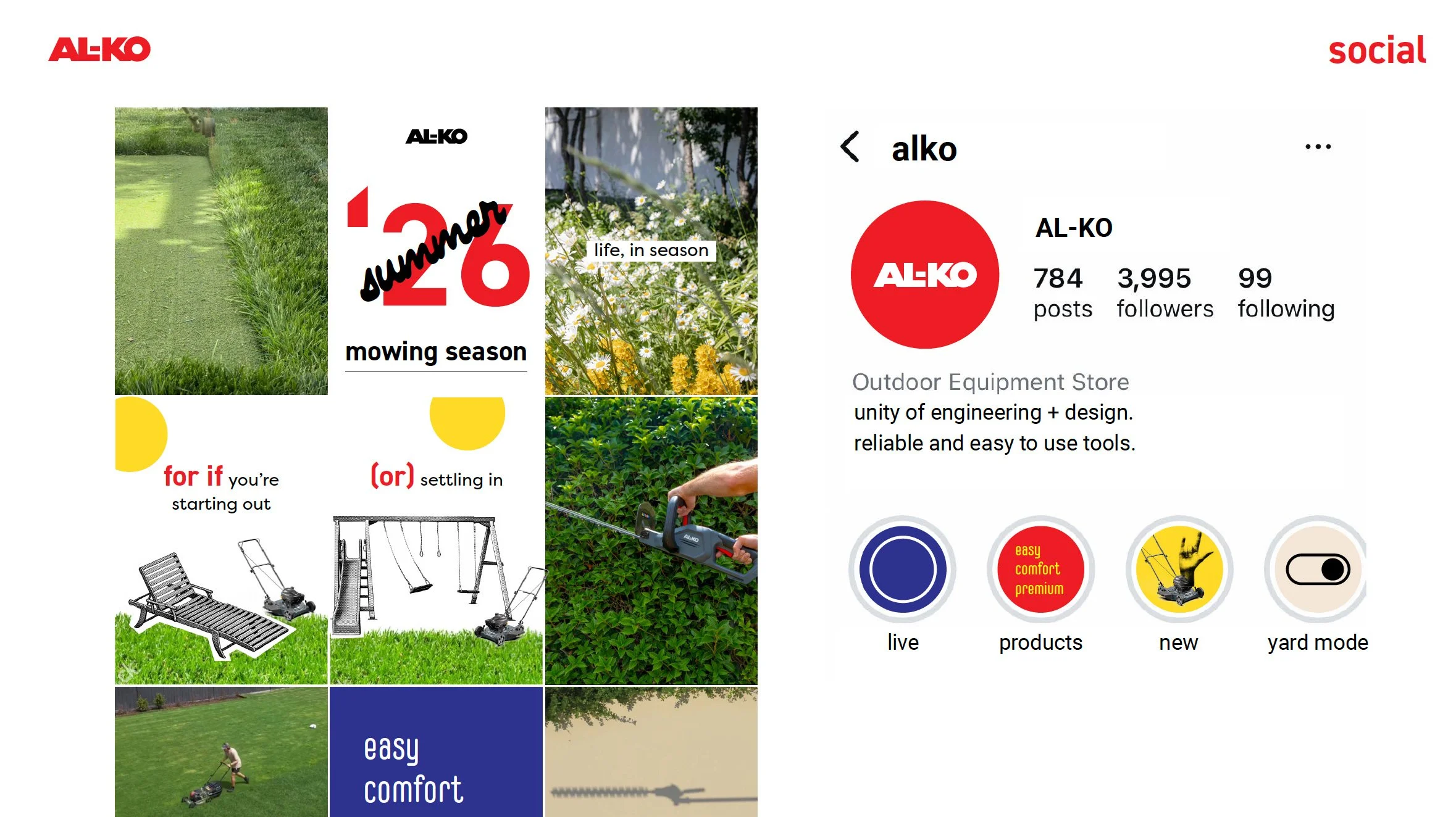
Same logo, same tagline, laid out in a new way: legible, fresh. Honor the brand, invigorate it where we see opportunity but stay true.
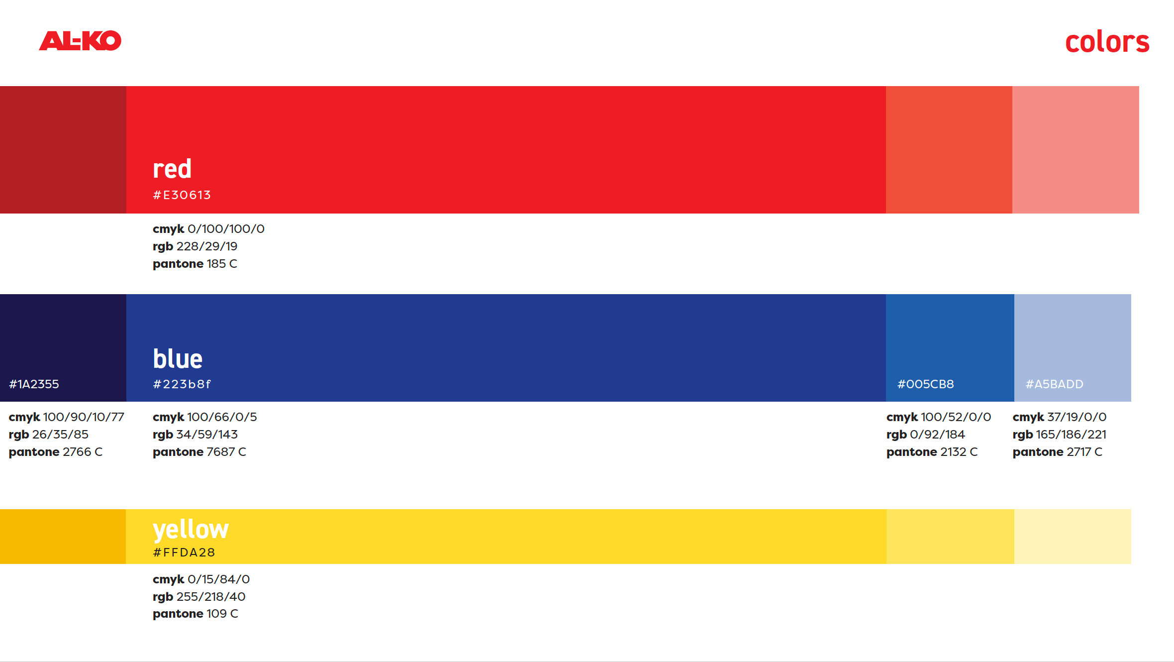
The red color, we’ve seen it with Snapper and Murray. The competitors use it. It’s not easy to differentiate online when you use the same color as everyone else. We cannot get rid of it, we want to stay true to the established brand. Suggesting we look towards the Bauhaus movement and enhance the pallet with complimentary colors that are combined in a way that feels different from what anyone else is doing in the OPE market. Used as an accent, see using the colors in these proportions. Pops of color that feel energetic
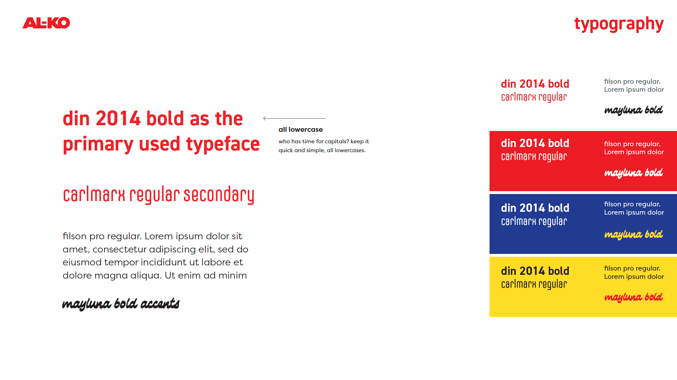
Lowercase modern, Sans Serif. Clean, geometric, easy to read. Might notice the all lowercase, younger generations are making the shift, and it traces back to Bauhaus. They believe small characters save time. And time is everything.
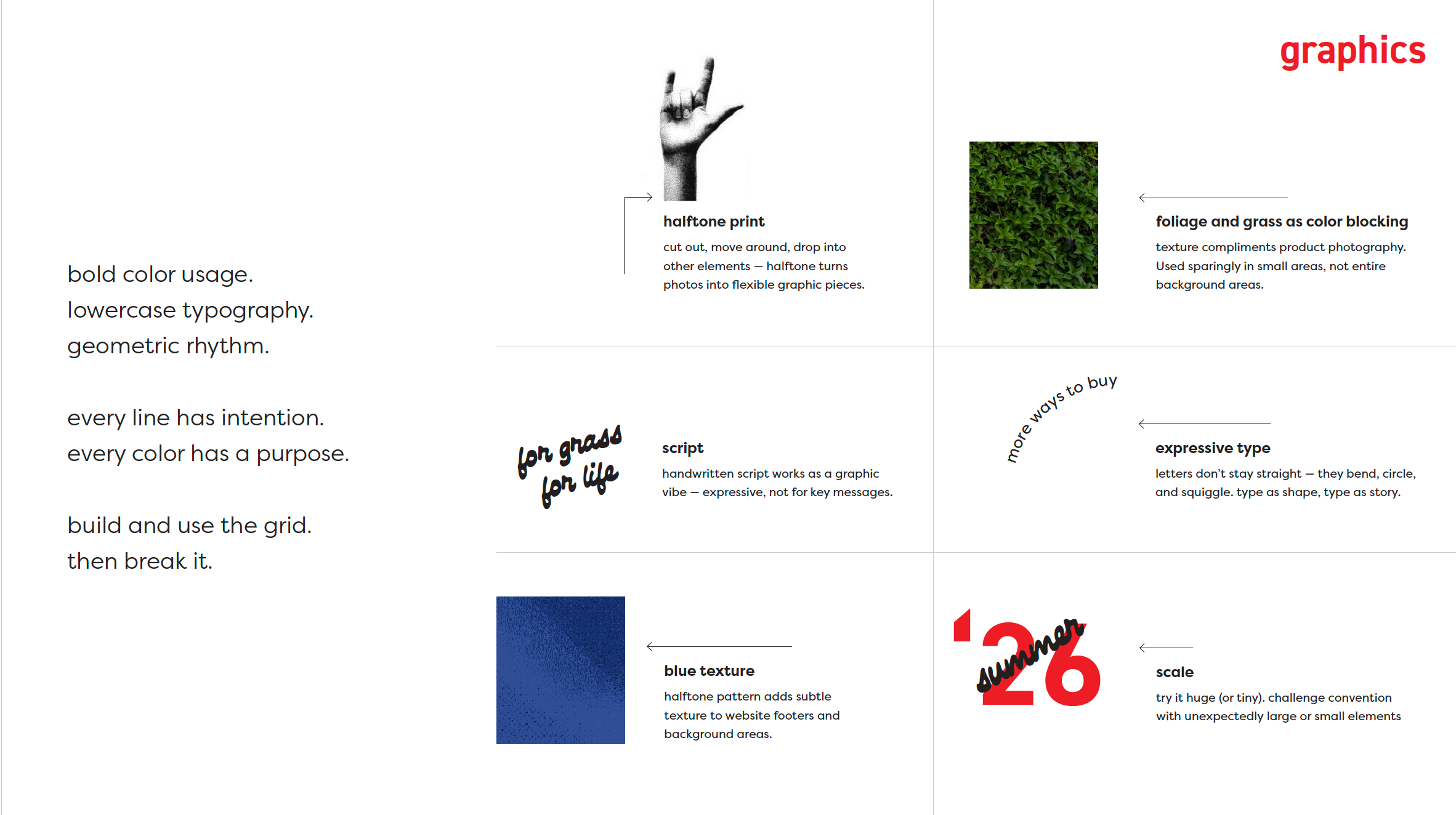
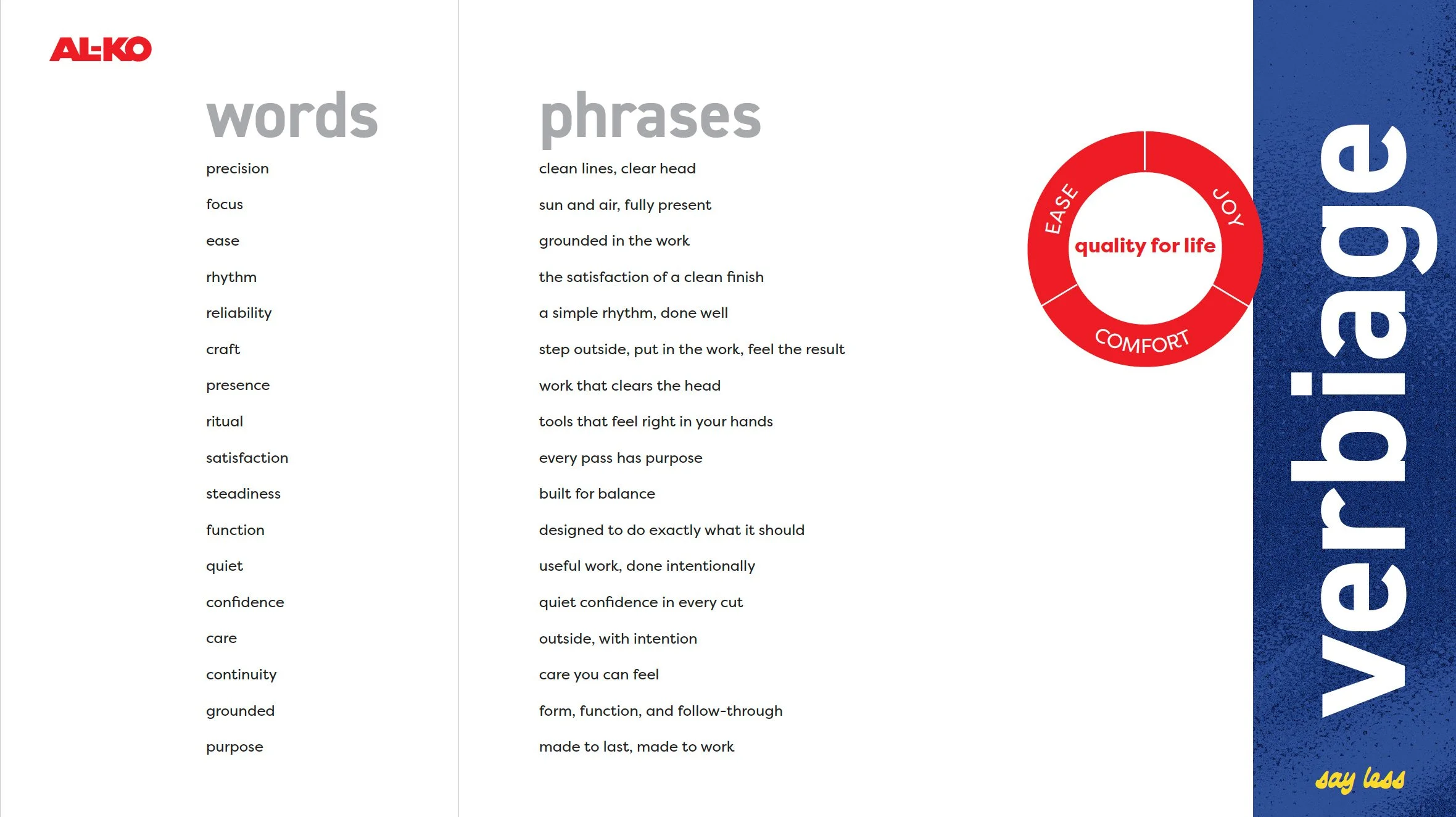
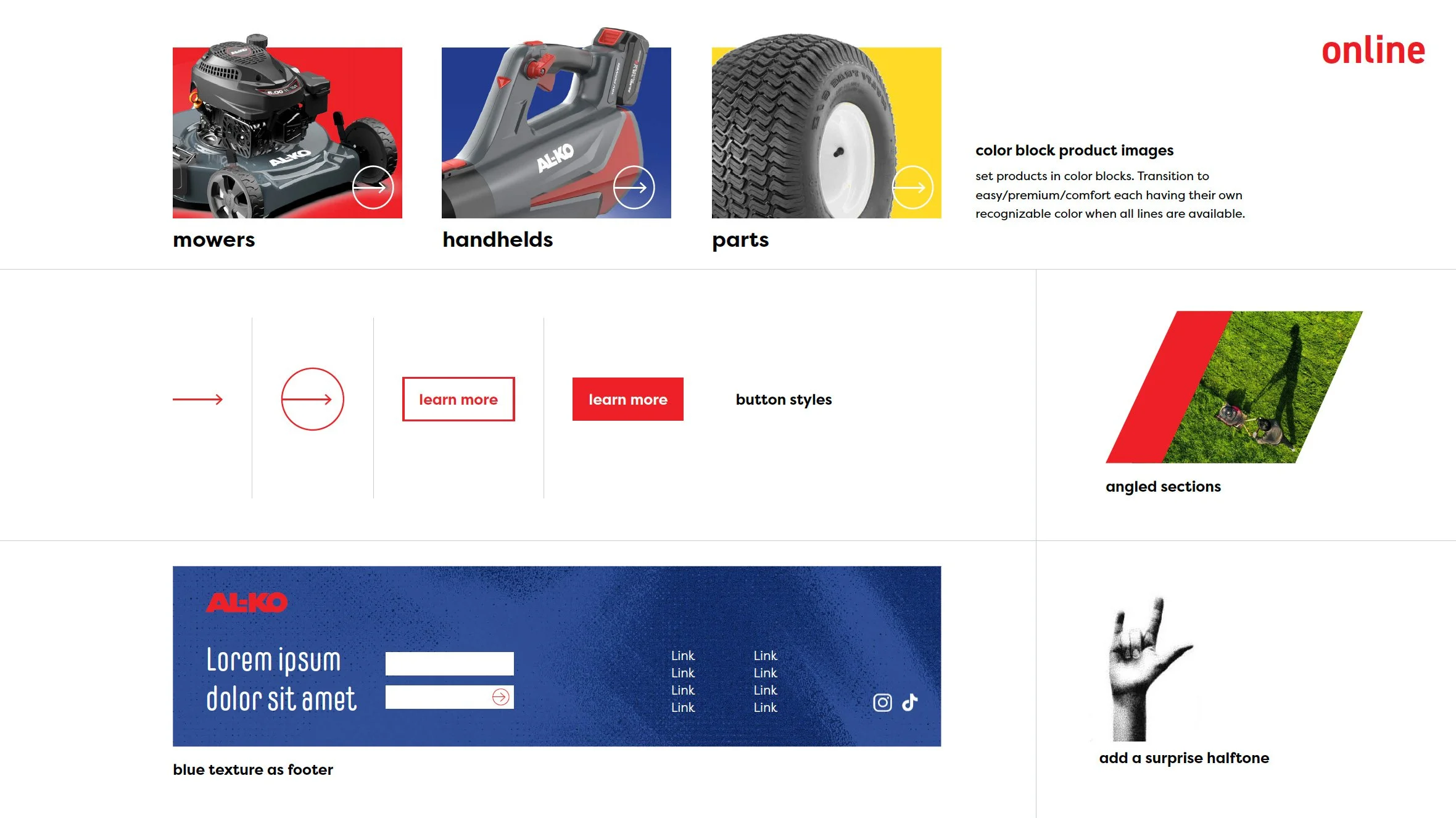
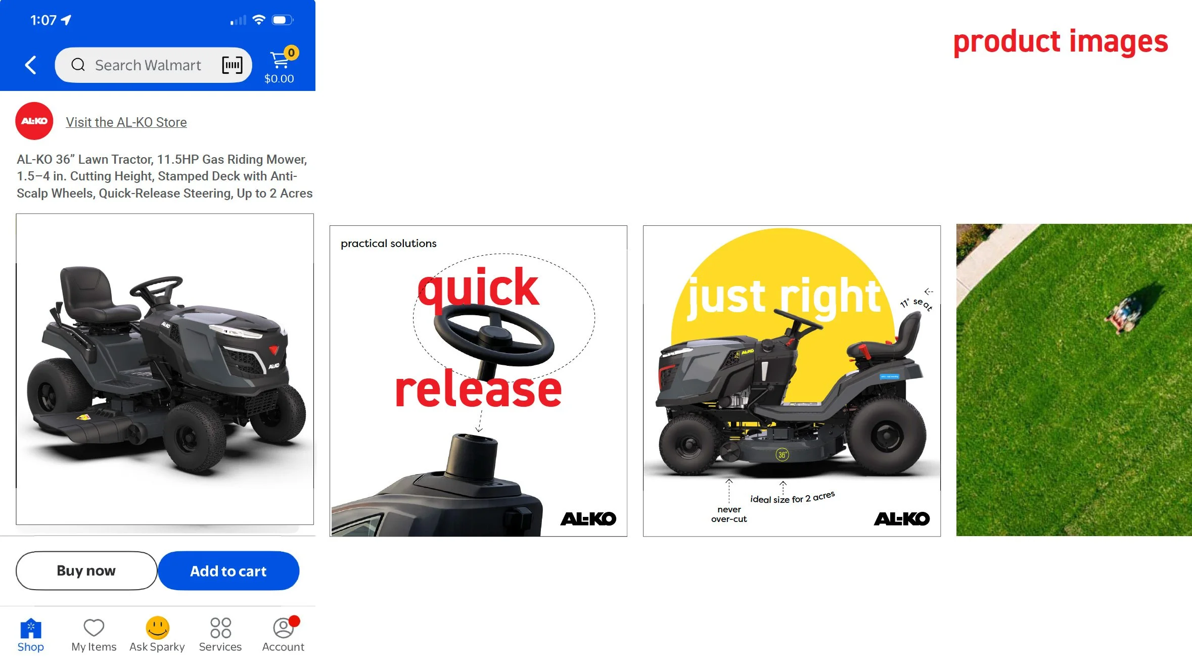
Show that Ecommerce images can be a bit bright. Differentiate through color and form.